Job Element Monitor (JEM) aka Digital Work Instructions
I got hired as eFlex was launching a pilot-program for their new software at an Opel plant in Poland, Opel owned by GM at the time. My first job was to redesign a big, new feature they were presenting—digital work instructions, which eFlex designated as Job Element Monitor (JEM). JEM instantly presented assembly line operators with instructions for the particular task at hand.  Prior to digital work instructions, these were typically laminated printed sheets in a book or loosely on a ring to flip through. Note: To update these rings and books, one would have to create or edit in an office, print, store, distribute to all locations and update local books or rings. Now, one change and the click of a button in an office, on the floor, or on a hammock in the Muldives can instantly update unlimited loctions.
I was told to design JEM with disregard to how it and the app currently looked. Assembly line operators were the primary user, but it would also likely be configured by a systems engineer. Initial user requirements included for the monitor and its content be visible from at least six feet—and in this instance, no user interaction with the monitor as it was to be positioned on the other side of the assembly line—out of reach. But, that would just be for this instance.
Seemed I pretty much had a free reign to design JEM. But free reign means designing smart and being able to justify your reasoning. First thing was to evaluate the CRUD version of JEM and the application as a whole.
Prior to digital work instructions, these were typically laminated printed sheets in a book or loosely on a ring to flip through. Note: To update these rings and books, one would have to create or edit in an office, print, store, distribute to all locations and update local books or rings. Now, one change and the click of a button in an office, on the floor, or on a hammock in the Muldives can instantly update unlimited loctions.
I was told to design JEM with disregard to how it and the app currently looked. Assembly line operators were the primary user, but it would also likely be configured by a systems engineer. Initial user requirements included for the monitor and its content be visible from at least six feet—and in this instance, no user interaction with the monitor as it was to be positioned on the other side of the assembly line—out of reach. But, that would just be for this instance.
Seemed I pretty much had a free reign to design JEM. But free reign means designing smart and being able to justify your reasoning. First thing was to evaluate the CRUD version of JEM and the application as a whole.  What did it do? What wasn’t it doing? Where were the obvious pain-points? Did the process flows make sense? And then how to wrangle the old design into a comprehensive and cohesive whole while moving it into entirely different design scheme? Working with the manufacturing veterans at eFlex answered a lot. A user story map unveiled unthought of items and actions.
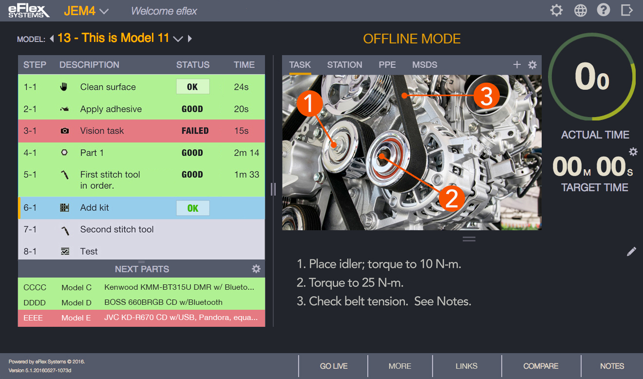
Essentially, JEM was a station monitor which listed all the tasks for a particular operation. For each task in the operation, a JPEG could be uploaded. A barely perceptible timer bar showed progress.
 Original JEM minimal viable product (MVP) - 2016
Experience knowing long exposure to bright, white computer monitors was very taxing to the eyes and cause for fatigue, my initial instinct felt a dark screen was apropos for the situation. Plus it would extenuate items of importance. I also included a white background mockup 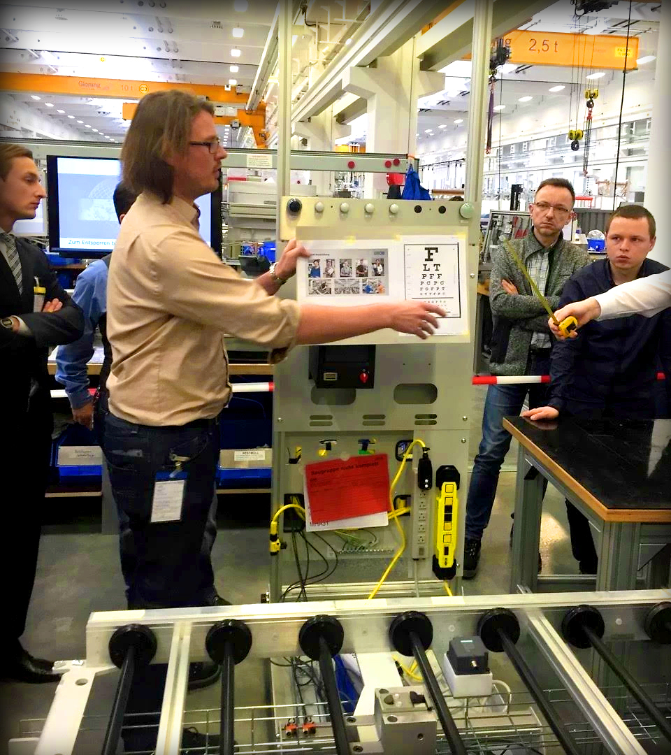 and “theme” icon button as a possible option or alternative. Bold labels had overshadowed smaller informational data buried in color-coded pill capsules. ALL the text was too small. From six feet away, most of the text was illegible. In the data grid there was also a lot of wasted column space. This is what they were currently wrangling with in Poland.
Initially, I redesigned the UI with all the same functionality as in the initial MVP. Same elements and identifiers. Just rearranged, resized, recolored. There already was a color-coding defined of which I did like, so I further defined and utilized blue as current, green as good/pass, red as error/reject/warning. I moved the Station dropdown to the header and maintained the header for navigation and global links. The subheader I reserved for part and operational information. I made the header labels insubordinate to their content. Content is king! Labels are servants to get you to the king then should bow out—not overshadow nor constantly demand attention.
and “theme” icon button as a possible option or alternative. Bold labels had overshadowed smaller informational data buried in color-coded pill capsules. ALL the text was too small. From six feet away, most of the text was illegible. In the data grid there was also a lot of wasted column space. This is what they were currently wrangling with in Poland.
Initially, I redesigned the UI with all the same functionality as in the initial MVP. Same elements and identifiers. Just rearranged, resized, recolored. There already was a color-coding defined of which I did like, so I further defined and utilized blue as current, green as good/pass, red as error/reject/warning. I moved the Station dropdown to the header and maintained the header for navigation and global links. The subheader I reserved for part and operational information. I made the header labels insubordinate to their content. Content is king! Labels are servants to get you to the king then should bow out—not overshadow nor constantly demand attention.
 The Before MVP and After mockup - 2016
The timer bar I redesigned into a timer component. The timer bar I made circular, with big “Actual” readouts within the timer circle—large enough for a team lead to read at a glance from a distance. Below the timer ring, listed subserviently, is the “Target” time. The timer circle is green until approaches x-% of the target time, then turns yellow for warning. Going over target time the circle and its numbers turn red. When quizzed about all the empty space below the timer, I replied it will get used. (And, of course it did.)
The task listing I also maintained the original color coding, but removed the extra Step column spacing. In addition, I attached the Type icon to the Description saving more space. And for quicker reading-sake all the data grid columns were switched to flush left (instead of centered). And all the horizontal and vertical column and row lines were removed for a clean look, and an optimized cognitive load. Tasks progressed by OK buttons in the listing. Handles were placed between panels to allow the user to adjust the sizes of the panels to suit their individual needs. If data is more important, scrub the left panel wider. If the work instruction image is more important, make the right panel wider and optionally deeper.
 Initial drawings
Buttons that changed the UI (e.g. Station Instructions, Compare Model) were originally at the top. I made a decision to place such action buttons within the footer. So with lots of discussion with stakeholders, some rearranging of elements a new interface was born. Being that eFlex had no specific design styles, no less a design system, and not yet knowing the best way to communicate with this IT team, I made mockups with extensive specification callouts for the developers. These would later evolve into InVision mockups for the developers.

Initially and primarily working with eFlex stakeholders, the project manager, and the product manager, I was able to get a gleaning of what this product required. In addition, there were several other major functions of the application that would need to be wrangled and woven all together into a smart, comprehensive package. Track & Trace (TnT) was like a whole separate, but attached application—and in a lot of ways treated as such. It had a bit of a different architecture that didn’t quite fit smoothly with the new. Vision was another legacy function tied in. Vision’s function was to control smart cameras like Cognex, and warehouse, search and retrieve 100s of thousands of images. OEE, Quality, and Kitting were a couple other functions not yet fully defined or implemented. Assembly though is where the heart of this Industry 4.0 application really lie. This is where all the stations were configured. This is where JEM really lies.
 JEM Redesigned
The initial new JEM design was pretty much a UI job. All the MVP functions just rearranged and the interface redesigned. The Opel plant in Poland adopted it and satisfied their requirements. The Corvette plant in Bowling Green, KY was hot on this new eFlex application. eFlex soon hired a VP of Sales and a Marketing Manager to start getting the word out—and off we go! This was just the beginning for JEM. A lot more features and functionality would soon be built into JEM. What seemed like a nifty feature of eFlex's assembly software, JEM would soon become the pivot and cornerstone for pulling all the eFlex functionality together into a manufacturing platform. A lot more on these additional developments further down the line.
 JEM Offline Mode